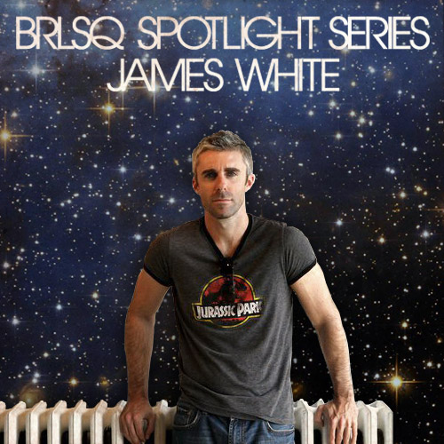
BRLSQ Spotlight Series: James White
Please introduce yourself to our corner of the world wide web.
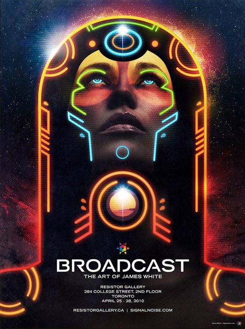
My name is James White and I'm a designer/artist from Dartmouth, Nova Scotia, Canada. I'm the 1-man crew behind Signalnoise Studio, which is my company and design blog where I showcase my work and the work of others that I enjoy. I've been drawing since I was 4-years-old and that raw creative enthusiasm never went away, even now in my 30s. When I graduated from high school it was pretty obvious that I'd be doing something in the creative industry, even though I didn't know what a "designer" even did. In 1995 I took a 1-year graphic design course at a community college in my hometown, followed by a 2-year course called Interactive Technology which, at the time, prepped me to be scooped up by the web industry upon graduation.
I spent a good 10 years working for various design places in Halifax, NS designing websites, print materials, etc., all the while continuing my personal creative growth on my own time. I never stopped drawing, and planted a LOT of time getting to know Photoshop and Illustrator and pushing my creative boundaries. When Signalnoise.com started to get recognition I managed to bring in my own clients. So during the day I'd be working on small local client jobs, and by night I'd be working with Toyota, Nike and MTV. This allowed me to quit the agency life and start the Signalnoise Studio.
Your design work draws a lot of inspiration from '70s film posters and typography, but is also very contemporary. Can you talk about your process from inspiration to concepts to design to finished product?
You're right. I'm a kid of the late 70s and 80s and I'm blessed with a very keen memory of that time period growing up with my parents and sister. I was into a lot of the stuff a typical boy was into, like super heroes, Star Wars, cartoons, comics, movies, toys and whatever else. And since I loved drawing back then, I'd sketch all of the characters I loved.

My roots in drawing carries on even today. Whether it's a client job or something personal I always start with the sketchbook, roughing up thumbnails and exploring different ideas on the fly. I might have the computer in front of me, but I try to limit my connectivity during that time. Me and the sketchbook, man. Once I have a rough idea of how I want things to look, I'll put together a digital composite, which is either a vector rough using simple shapes or a very loose gestural painting in Photoshop. This is where I experiment with colour and layout.
At this point I should have a good idea of the finished product BUT I always leave my digital process as open as I can so I can experiment and try some different things along the way. This is really important, especially with my newer work as I dive into digital painting. That stuff is almost ALL experimentation as I build the forms of characters, elements and backgrounds. After things have shaped up with the art side, I'll lay in the typography, logos and any other content that needs to be in there.
What are some of your favorite '70s / '80s movie posters?
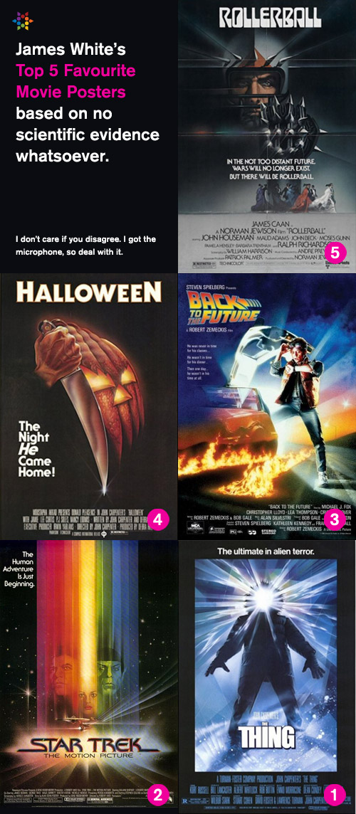
Oh man, so many for so many reasons. How about I just give you a top 5 list? Here we go:
5. ROLLERBALL (1975, Bob Peak)
Brutal design of the spiked-up character offset with the people in ball-gowns and tuxedos. Looks like they're moving in slow motion down there, and I just love the contrast. So badass.
4. HALLOWEEN (1978, Bob Gleason)
This poster mesmerized me when I was a kid. So scary. And then as I grew up the appreciation shifted to the brilliant design, the knife morphing into the pumpkin. Genius.
3. BACK TO THE FUTURE (1985, Drew Struzan)
I'm convinced that a better poster could never have been created for BTTF. This painting of a concerned Marty McFly looking at his watch while climbing into the DeLorean perfectly captures the theme, story and heart of the film. Perfect execution.
2. STAR TREK: THE MOTION PICTURE (1979, Bob Peak)
Gene Roddenberry: "Hey Bob, you have any ideas for the Star Trek movie poster?" ... Bob Peak: "GIANT RAINBOW!"
1. THE THING (1982, Drew Struzan)
My favorite movie poster of all time. If you know Struzan at all, you probably know the story. He painted this the night before it was to be shipped to the studio, based on reference photography of himself in a parka. No actors featured, just a stark, bold, iconic and accurate representation of the film. If I had $100,000 kicking around, this original artwork would be on my wall.
You do a lot of self-initiated work which fits nicely in your portfolio next to your client work. Which do you prefer working on? Do you ever have someone contact you after seeing something you designed "for" them, asking to use it for themselves?
I enjoy doing the personal work, just because I created it because I wanted to. I was once asked after doing a talk why I do so much for "for free", but I always think of it in terms of drawing. When I was growing up I used to draw Superman all the time, which is what I do today only the tools have changed from a pencil to a computer.
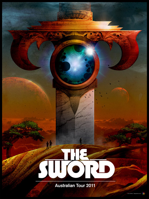
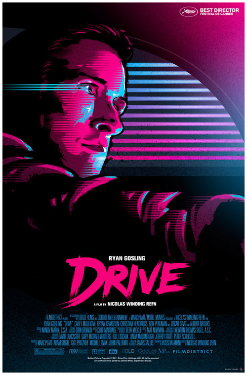
Self-initiated work is the backbone of Signalnoise. When I'm not doing something for a client, I'm filling my time with personal projects, of which I have a long list. There have been several instances where I've done something and it's attracted the attention of the right people. The best example is my DRIVE poster. After seeing the film I created the poster out of sheer enthusiasm for what I saw onscreen. A made-up dream project, if you will. The online response to the design was amazing, and after a few long phone calls by my agent at Mystery Box, the poster was approved by the film company to be official.
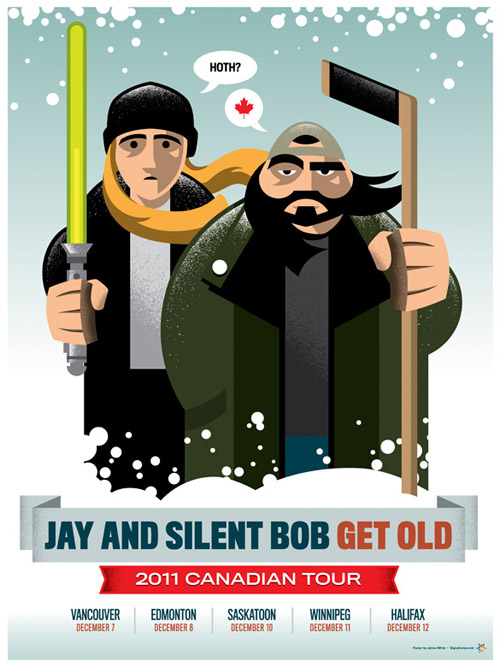
Another example is Kevin Smith. He asked Canadian designers to send over any artwork to use for a tour poster. I decided to create an original piece for him, which he loved and ended up using for his Canadian tour. After which he commissioned me to design a poster for his show in London, a t-shirt design for Jason Mewes, and a 10-poster set featuring each Canadian province. All of this because I took it upon myself to create something because I always liked the Jay and Silent Bob characters. Kevin is a great guy, awesome to work with.
Favorite Canadian designers nowadays?
I'm a big fan of the team over at Phantom City Creative, based in Toronto. Absolutely love their take on the classic movie poster style with bold colours and beautiful execution. Another fantastic team doing wonderful work are the boys at Doublenaut in Toronto. Some lovely design and form happening over there. And finally my pal Mike Holmes from my neck of the woods has been killing it with his smooth and funny illustration style(s).
Vive le Canada!
Thanks James! Please be sure to check out more over at Signalnoise Studio and follow the boss on Twitter.